Google Only Ranks the Mobile Version of Your Site

Google stopped ranking your desktop homepage years ago. Its crawler now evaluates the mobile version of your site first, full stop, which means every blurry image, oversized menu, and slow-loading section on a phone is what actually determines whether you show up in search. If your mobile site is worse than your desktop site, your rankings are being built on the weaker version, not the one you're proud of. A lot of Houston service business owners still check their site on a laptop, see it looking sharp, and assume everything's fine. Meanwhile the phone version they never open is quietly setting the ceiling on how many people ever find them in the first place.
Google indexes and ranks your mobile site first, so a weak phone experience caps your search visibility no matter how good your desktop site looks.
Tiny Tap Targets Are Costing You Phone Calls
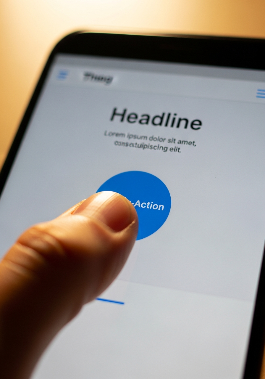
A button sized for a mouse pointer is not automatically sized for a thumb. When your "Call Now" or "Get a Quote" button is too small or crammed next to other links, your visitor either mis-taps, gets frustrated, or gives up before reaching you. Every extra tap or zoom between someone landing on your site and reaching your phone number is a chance for them to leave and call a competitor instead. This matters most in the exact moment your leads are most valuable, standing in their kitchen with a leaking pipe or driving past a job site, phone in hand, ready to call whoever answers first. Your buttons need to work at thumb-size, not mouse-size.
Undersized buttons and cramped links on mobile cause mis-taps and abandonment right when a lead is closest to calling you.
Ready for a Site Built Mobile-First?
Call <a href="tel:2819781847">281-978-1847</a> or start a project with our team to get a mobile-first website built right from day one.
Slow Load Times Kill Mobile Trust Fast

Mobile connections are slower and less forgiving than the fast office wifi your site was probably tested on. If your homepage takes more than a couple seconds to load on a phone, a real chunk of your visitors never see it at all, they bounce straight back to the search results and call the next name on the list. Page speed on mobile isn't a technical nice-to-have, it's the difference between a lead who waits and a lead who's already dialing someone else. Large uncompressed images and heavy design elements that look fine on a laptop are usually the first thing slowing your site down on a phone.
Slow mobile load times cause visitors to bounce before your site even finishes loading, handing the lead to a faster competitor.
Forms Built for a Mouse Don't Get Filled Out on a Phone

A contact form with five fields and a tiny dropdown menu is annoying on a laptop and nearly unusable on a phone screen. Every extra field, every dropdown that's hard to tap, every form that doesn't trigger the right keyboard (like a number pad for a phone field) adds friction at the exact moment someone decided to reach out. The businesses winning the most leads online usually have the shortest, simplest mobile forms, not the most detailed ones. If you want more quote requests from your website, start by opening your own contact form on your phone and timing how long it takes to fill out.
Long or clunky mobile forms create friction right when a lead is ready to reach out, so shorter and simpler almost always converts better.
AI Search Tools Read Your Mobile Site Too

Mobile-first isn't just a Google ranking rule anymore. Tools like ChatGPT, Gemini, and Google's AI Overviews pull from the same crawled version of your site that mobile visitors see, so a cluttered or slow mobile page hurts your odds of getting mentioned by AI assistants just as much as it hurts your search rankings. A clean, fast mobile site with clear service information is easier for both human visitors and AI tools to actually understand. For a Katy, Sugar Land, or Cypress service business competing for the same searches as a dozen nearby competitors, that difference in how cleanly your site reads on mobile can decide whether you show up at all.
AI search tools crawl the same mobile-optimized version of your site as human visitors, so mobile-first design also improves AI visibility.
Build Mobile First
The fix isn't a mobile-friendly afterthought bolted onto a desktop design, it's flipping the order entirely. First, design for the smallest screen before the desktop layout exists, so nothing important gets squeezed in later. Second, test every button, form, and phone number on an actual phone before the site goes live, not just in a browser preview. Third, check mobile Core Web Vitals in Google Search Console monthly so slow pages get caught before they cost you leads. It's the same approach behind every Social Reach Co. website design project, and it's worth pairing with a look at the other website mistakes that quietly cost businesses leads.
The Real Fix
Your desktop preview isn't lying to you, it's just not the version your leads see. Most service business sites still get built laptop-first and mobile-tested as an afterthought, if at all. Every Social Reach Co. site is built mobile-first from day one, because that's where your next phone call actually starts. Ready to see how yours holds up? Start a project or take the 5-Second Test.
Ready for a Site Built Mobile-First?
Call <a href="tel:2819781847">281-978-1847</a> or start a project with our team to get a mobile-first website built right from day one.
More from our blog
Explore strategies and insights for growing your brand
What partners say
Real results from people who trusted us with their business.
"From start to finish, their team demonstrated professionalism, expertise, and a genuine commitment to delivering top-notch results. Their innovative approach and attention to details set them apart from other companies..."
"Really happy with how my website turned out. They were so helpful in designing it to be exactly what my company needed. Great customer service, thank you! I'm a happy customer and highly recommend!"
FAQ
Common questions about content strategy and how Social Reach works
What kind of agency are you?
We’re a full-service marketing and design agency that covers both digital and physical touchpoints. That includes websites, SEO, and advertising, as well as printed materials like flyers, signage, and branded merchandise. Our goal is to make sure your business looks professional and consistent everywhere your customers interact with you—online and offline.
How do your services work together to grow my business?
We treat your website as the foundation, then build around it with marketing and design. Online, that might mean SEO, content, or ads to drive traffic. Offline, it includes branded materials that support your presence in the real world. When everything is aligned—your website, marketing, and print—it creates a stronger, more trustworthy brand that converts more customers.
Do I need both digital marketing and print materials?
It depends on your business, but many local and service-based companies benefit from both. Digital marketing helps people find you, while print materials reinforce your brand in person—whether that’s at events, in your storefront, or through direct outreach. We help you choose the right mix so you’re not overspending, but still making the biggest impact.
What services do you offer beyond website design?
In addition to building high-performing websites, we offer SEO, digital advertising, and content strategy to help drive traffic and leads. On the design side, we create everything from logos and brand assets to printed materials like brochures, signs, and merchandise. This allows us to support your business across every stage of growth.
Why should I work with one team for both digital and print?
Working with one team keeps everything consistent and strategic. When different vendors handle your website, marketing, and print materials, the messaging and design often become disconnected. We make sure everything—from your website to your flyers—feels cohesive and supports the same goal: building trust and bringing in more customers.
Let's build something that works
Schedule a call with us to discuss what you need to grow

{"@context": "https://schema.org", "@graph": [{"@type": "BlogPosting", "headline": "Why Mobile-First Web Design Isn't Optional for Service Businesses", "description": "Most service business websites are built for desktop, not the phone most leads use first. Here's what mobile-first web design actually fixes and why it matters.", "image": "https://cdn.prod.website-files.com/695e978db35c4de5af1f5a24/6a7e24d804cdf5d17e9edd70_mobile-first-web-design-main-image.png", "author": {"@type": "Organization", "name": "Social Reach Co."}, "publisher": {"@type": "Organization", "name": "Social Reach Co.", "logo": {"@type": "ImageObject", "url": "https://cdn.prod.website-files.com/695e978db35c4de5af1f5a24/695ee0dd9d7539a12f147832_Social%20Reach%20Logo.avif"}}, "datePublished": "2026-08-13T00:00:00-05:00", "dateModified": "2026-08-13T00:00:00-05:00", "mainEntityOfPage": {"@type": "WebPage", "@id": "https://www.socialreachco.com/blog/mobile-first-web-design-service-businesses"}, "url": "https://www.socialreachco.com/blog/mobile-first-web-design-service-businesses", "keywords": "mobile-first web design, mobile-first web design service businesses, mobile web design for small business", "articleSection": "Web Design"}, {"@context": "https://schema.org", "@type": "FAQPage", "mainEntity": [{"@type": "Question", "name": "What does \"mobile-first\" web design mean?", "acceptedAnswer": {"@type": "Answer", "text": "Mobile-first web design means building and testing a website starting with the smallest phone screen, then scaling the layout up to tablet and desktop, instead of designing for desktop first and shrinking it down afterward."}}, {"@type": "Question", "name": "Why does Google only look at the mobile version of my website?", "acceptedAnswer": {"@type": "Answer", "text": "Google's mobile-first indexing means its crawler primarily uses the mobile version of a site to determine rankings, since most searches now happen on phones. A slow or cluttered mobile site can hold back rankings even if the desktop version looks great."}}, {"@type": "Question", "name": "How do I know if my website is mobile-friendly?", "acceptedAnswer": {"@type": "Answer", "text": "Open your own site on your phone and try calling your business, filling out your contact form, and reading a full page without zooming. If any of those feel clunky, your site likely needs a mobile-first redesign."}}, {"@type": "Question", "name": "Does mobile-first web design cost more than a regular website?", "acceptedAnswer": {"@type": "Answer", "text": "Not usually. Mobile-first is a design approach, not an add-on feature. Building it right the first time typically costs less than fixing a desktop-only site after it's already losing leads."}}, {"@type": "Question", "name": "Does mobile-first design also help with AI search visibility?", "acceptedAnswer": {"@type": "Answer", "text": "Yes. AI tools like ChatGPT and Google AI Overviews crawl the same mobile-optimized version of a site that phone visitors see, so a clean, fast mobile site improves both search rankings and AI visibility."}}]}]}